
Website Strategy
10 Vacation Rental Website Examples and What to Borrow
Study ten vacation rental website patterns covering cabins, luxury stays, portfolios, booking flows, local content, trust, mobile design, and conversion.

When you save a website as inspiration, write down the decision it helped you make. Could you find the right cabin, tell who uses the pool, or get a price? Here are ten layouts I’d look for, with a sample detail you can borrow for your kind of rental.
A real vacation rental website to explore
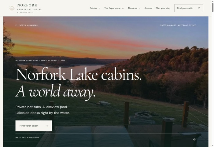
Norfork Lakefront Cabins gives three stays their own pages and explains what guests share across the estate. The Overlook Cabin page also includes a Guesty availability widget. Use the screenshot to see what makes a holiday rental website easier to book: guests can compare the stays, understand the property, and find availability without having to guess where to go next.
Start with these three points
- Evaluate examples by guest decisions, not decorative style.
- The booking path, total-price clarity, and mobile experience matter as much as the homepage.
- Borrow principles—never another property’s identity, copy, photographs, or claims.
Fictional family stay · Cedar Bend Cabin
“Two bedrooms near [Park Name], with a table for four and breakfast on the screened porch.” I’d put the porch photo beside it, with a short line about the queen and twin beds and a button that says Check Cedar Bend dates.
How the examples were selected
Use one guest task when comparing examples. For a group, try to find two enclosed bedrooms and explain who sleeps where. For a waterfront trip, look for which access is included and which is shared. For a returning guest, see how quickly you reach the correct cabin’s dates.
Write down which element answered the question. It may be a caption, a date link, or a comparison row. Use the idea with your own facts and photos. A layout you can explain is more useful than a screenshot you can only copy.
This guide studies recurring patterns visible in vacation-rental portfolios, direct-booking showcases, and hospitality websites. It does not claim that appearance proves revenue performance. Without access to private analytics, conversion claims about a third-party site would be speculation.
Use public showcases such as CraftedStays, FullStay, and InsideOut for additional visual research, then evaluate each live experience independently.
Example 1: the single-property story
Best for: a distinctive cabin, lake house, beach home, villa, or retreat.
The strongest version leads with one unforgettable image, one clear guest promise, immediate availability access, and a compact set of proof. The page then moves through experience, rooms, amenities, location, reviews, policies, and booking.
Conversion lesson: do not make the guest choose between ten generic messages. Sell one specific stay.
Example 2: the destination-first cabin
Best for: properties whose demand is tied to hiking, lakes, national parks, ski areas, or outdoor recreation.
Pair the property with useful trip logistics: drive times, trail access, seasons, equipment, weather considerations, and local expertise. The site becomes both a booking path and a planning resource.
SEO lesson: firsthand destination usefulness is harder to copy than a generic property description.
Example 3: the luxury editorial stay
Best for: design-led, premium, wedding, wellness, or concierge properties.
Use disciplined typography, exceptional photography, generous spacing, material details, service information, press, and calm transitions. Luxury is communicated through specificity and restraint—not repeated claims that the property is luxurious.
Conversion lesson: make service standards and the booking process as polished as the imagery.
Example 4: the family decision page
Best for: larger homes, reunions, multigenerational travel, and family destinations.
Answer sleeping arrangements, bathrooms, stairs, child equipment, parking, kitchen capacity, noise, pet rules, distance to activities, and rainy-day options early.
Conversion lesson: practical certainty often closes a family booking better than another lifestyle paragraph.
Example 5: the multi-property collection
Best for: managers and owners with genuinely different properties.
Give travelers useful filters for location, capacity, property type, accessibility, amenities, and trip occasion. Every property needs a distinct canonical page with synchronized availability and consistent comparison data.
Technical lesson: avoid creating thin filter URLs that search engines can crawl endlessly.
Examples 6–10: five conversion patterns
Event and wedding lodging
Explain group capacity, venue proximity, parking, gathering spaces, vendor logistics, and inquiry timing.
Pet-friendly specialist
Show fencing, floors, fees, limits, nearby walks, cleaning practices, and honest restrictions.
Accessible-stay guide
Use measured, precise access information rather than vague “accessible” claims.
Repeat-guest home base
Make the property name, availability, returning-guest path, and seasonal updates effortless to find.
Local authority portfolio
Connect property collections with real neighborhood, itinerary, attraction, and seasonal expertise.
The 12-point website critique
- Can a new visitor explain the stay in five seconds?
- Is availability visible without hunting?
- Does the first screen work on a phone?
- Are total pricing and mandatory fees understandable?
- Does the gallery answer practical questions?
- Are sleeping arrangements precise?
- Is ownership or management identity clear?
- Are policies reachable before payment?
- Does checkout feel continuous and secure?
- Does the site contain firsthand local value?
- Can important pages be reached through normal links?
- Are analytics measuring the booking journey?
What beautiful examples often hide
A screenshot cannot reveal delayed calendar sync, payment errors, inaccessible controls, weak mobile performance, unclear cancellation, duplicate pages, missing analytics, or poor search indexation. Always test a live date search, policy path, contact route, and checkout transition.
Create your own evidence library
Before redesigning, save the current mobile homepage, availability search, property detail, price breakdown, policy view, checkout, confirmation, and contact path. Record what a first-time guest must understand and do at every stage. After launch, repeat the same capture and compare behavior using analytics, completed test bookings, support questions, and real guest feedback.
This turns “I like this design” into an operating standard: a clearer promise, fewer unnecessary steps, stronger proof, faster decisions, and a measurable reservation path.
How Direct Stay Solutions applies these principles: We design owner-controlled vacation rental websites around each property’s brand, direct-booking path, and compatible booking software. The goal is not to copy a showcase—it is to create a clear, trustworthy website guests can use to understand the stay and book directly.

In this Direct Stay project, the collection has one recognizable name and gives each cabin its own place in the site. Identify where a guest can tell the properties apart before writing your own brief.
Photo from the Direct Stay Norfork Lakefront Cabins project.
Turn a website you like into a brief for your rental
- Save one screen. Circle the task it helps guests complete.
- Match your own content. Choose the property photo and fact that would fill that role.
- Retest. Ask a friend to complete the same task using your draft.
Related guide: Cabin Photography for Your Website: A Guest-Focused Shot List.
Turn the examples you like into pages that fit your rental
I’d show how the layout ideas would work with your actual photos and features, then build the pages and booking path that fit your stay.
- Custom website and a recognizable brand. We use your property’s photos and story to build mobile-friendly pages that show guests what they’d be booking.
- Search visibility. We organize the pages around what guests look for and set up the technical SEO. The managed plan includes a monthly search review.
- Direct booking. We connect a compatible calendar, booking engine, or inquiry flow and check the handoff. Third-party software and payment processing may cost extra. Explore compatible booking tools.
- Website management. The managed plan includes hosting, security, backups, maintenance, and an SEO review. See plans and what’s included.
See the pieces working together at Norfork Lakefront Cabins, where each stay has its own page under one brand and Overlook Cabin connects to Guesty for availability and reservations. See the Norfork project.
Frequently asked questions
What makes a good vacation rental website?
A clear property promise, excellent images, synchronized availability, transparent pricing, secure booking, authentic proof, useful local content, and strong mobile usability.
Should my website look like Airbnb?
Borrow familiar usability patterns where helpful, but build a distinct property brand and avoid implying an affiliation that does not exist.
How many pages should a vacation rental website have?
Enough to satisfy property, booking, trust, policy, contact, and destination needs without creating thin or repetitive pages.
Can a beautiful website increase bookings?
Design can improve clarity, desire, and trust, but conversion also depends on traffic quality, price, fit, availability, policies, technology, and operations.
May I copy another vacation rental website?
No. Study principles, but create original copy, images, identity, layout decisions, and claims suited to your own property.
Meet Dane, founder of Direct Stay Solutions

Point me to the website example you’d borrow from and tell me why. I’ll show how I’d adapt that idea to your property, guests, and booking setup.